A system built to scale a growing product
The EZRHA Design System was created to support a fast-moving product team operating under real startup constraints: multiple contributors, evolving strategy, and limited resources.
Its purpose was not only to unify the interface, but to establish a shared framework that enables designers, interns, and engineers to move faster while maintaining consistency, quality, and long-term scalability.
The Challenge
Scaling design beyond a single contributor
When I joined the project, the existing Figma file lacked fundamental structure. Components, layouts, and conventions were inconsistent, making reuse difficult and scalability impossible.
At the same time, the team was about to grow: a new designer and two interns were joining, and engineers were actively contributing to UI decisions. Without a clear system, collaboration risked becoming fragmented and slow.
Additionally, the product’s visual language felt outdated, a mix of UI kits and patterns with no clear direction beyond color usage.
Goals
Creating clarity, speed, and a modern identity
The design system was built to address three core needs:
- Establish a consistent and scalable component framework
- Enable faster onboarding and collaboration for new designers and interns
- Modernize the product’s visual language to reflect trust, clarity, and innovation
This meant rebuilding every component from the ground up, defining tokens, scales, and conventions that could be reliably followed by anyone touching the product.
Research-Driven Aesthetic Direction
Designing trust in AI-driven experiences
Before defining the visual language, we conducted qualitative research with ~20 users, focusing on their experiences with AI products in job-search contexts.
We explored:
- What makes AI experiences feel trustworthy
- Which visual patterns feel clear vs. overwhelming in job application processes
- How users perceive “modern” versus “experimental” UI in high-stakes decisions
These insights informed a series of visual explorations that later became the foundation of the style guide, ensuring the system was grounded in user perception, not aesthetic trends.
System Foundations
Lean by design, intentional by necessity
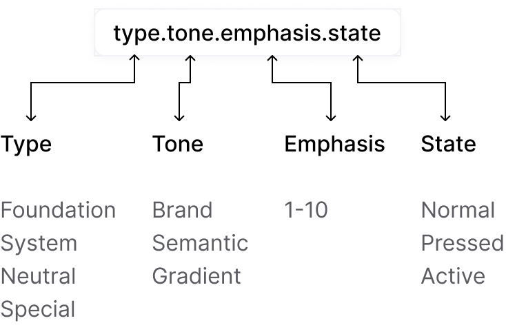
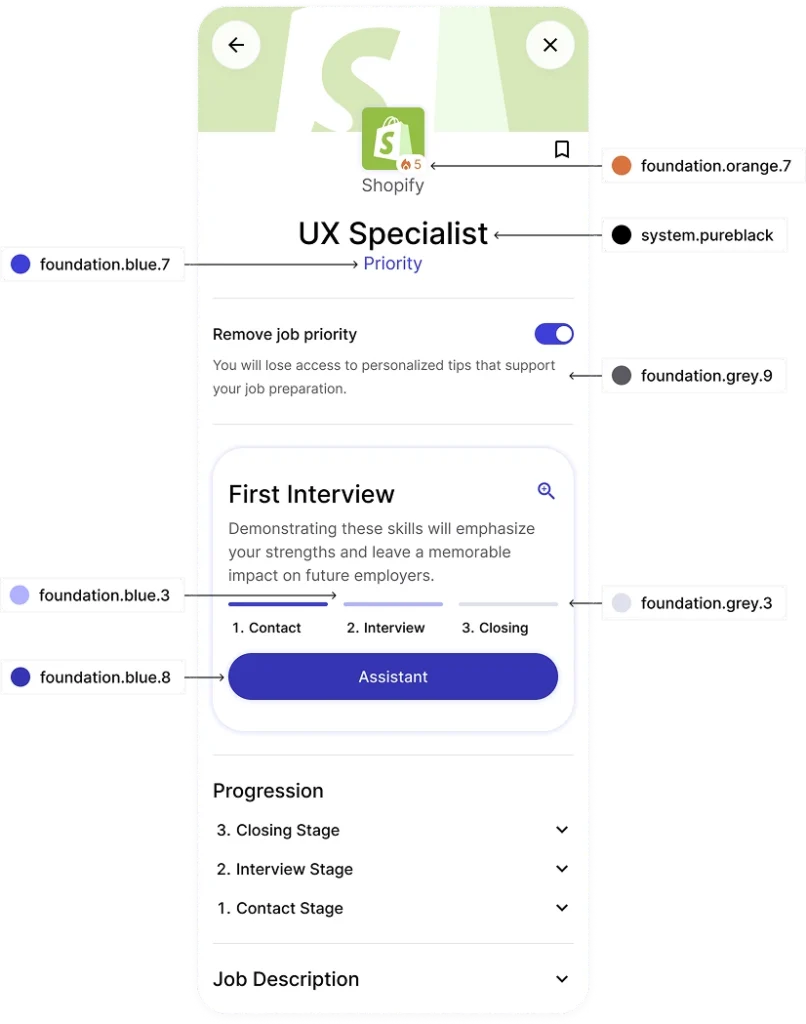
The token structure and naming conventions were designed to prioritize clarity and communication across the team.
As a startup, we deliberately avoided an overly complex token architecture. Instead, we focused on a lean, understandable system that could scale incrementally without becoming a maintenance burden.
This approach enabled:
- Faster decision-making
- Easier handoff between designers
- Clear alignment with engineering implementation
The system remains structured enough to scale, while staying lightweight and adaptable.
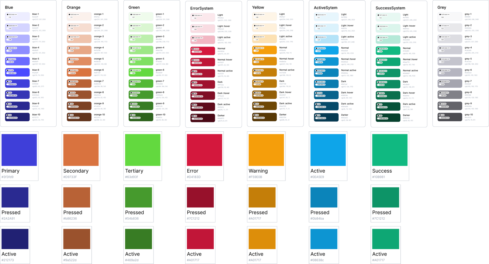
Color System
Accessible, reusable, and tested in depth
The only fixed input at the start was EZRHA’s primary blue. From there, the full palette was developed through multiple rounds of testing.
We explored:
- Different color-scale generation methods
- Complementary and tertiary schemes
- Accessibility contrast across all shades
Every color in the system is usable by design, not decorative placeholders. The palette supports multiple states, combinations, and surfaces while remaining accessible and cohesive across the product.
Typography
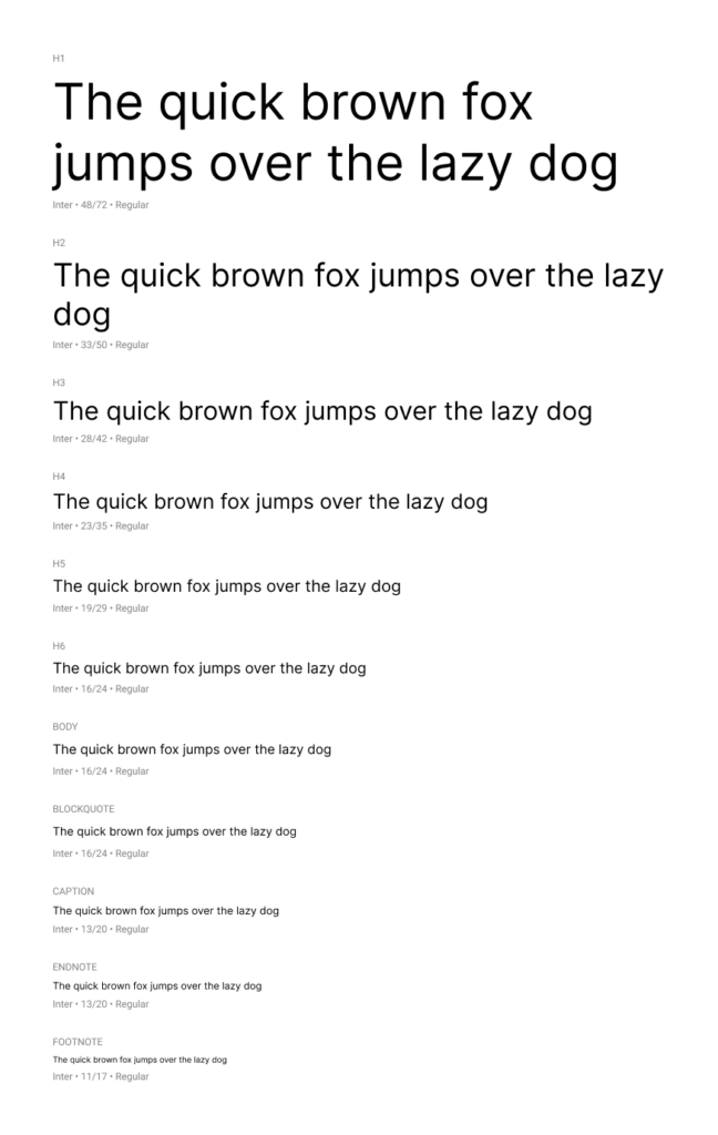
Functional by necessity
Due to time and resource constraints, the typographic system was built using Inter a highly legible and production-ready typeface.
Rather than investing time in aesthetic exploration, the focus was placed on:
- Creating a clear and consistent scale
- Establishing predictable spacing between headings and body text
- Optimizing readability for long-form job descriptions
- Ensuring strong contrast on white backgrounds
This decision prioritized speed, clarity, and implementation reliability over stylistic experimentation.
While typographically conservative, the system is structurally sound and ready to evolve in future iterations.
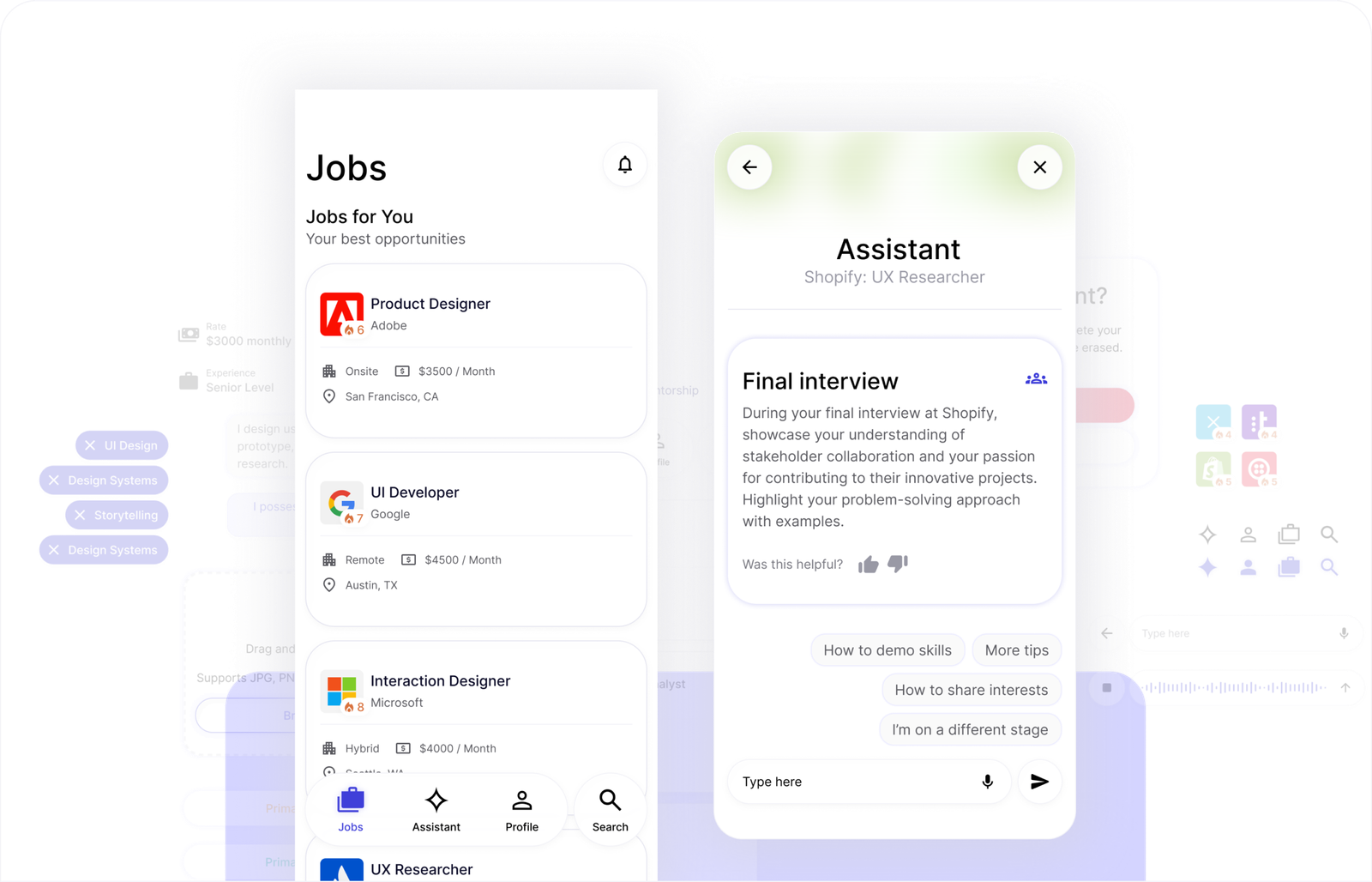
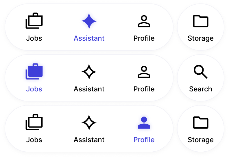
Components
Consistency without sacrificing personalization
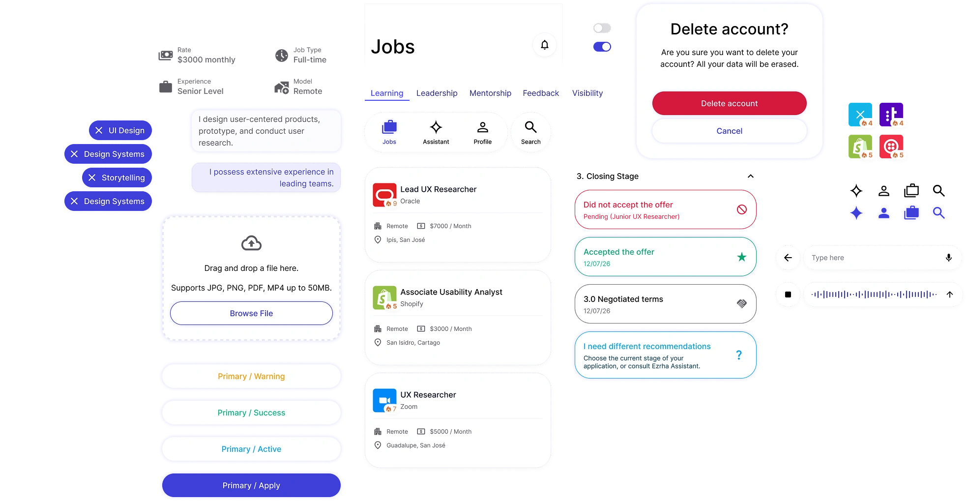
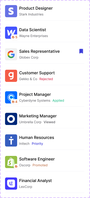
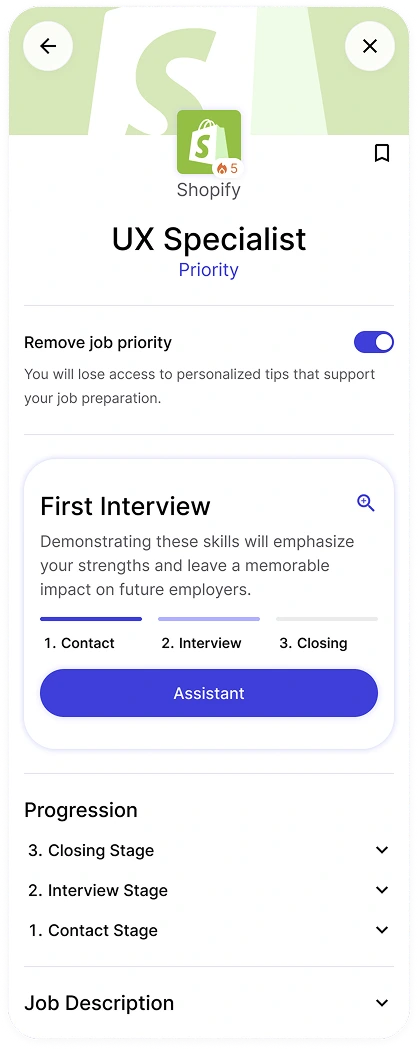
EZRHA’s components often display highly variable data, different roles, salaries, locations, requirements, and statuses, while still needing to feel cohesive.
Components were designed with:
- Flexible variants
- Clear constraints
- Predictable behavior
This allows each job opportunity to feel unique and personalized, while maintaining a consistent system that scales across the app.
EZRHA’s components handle highly variable and often unpredictable content:
- Job titles of inconsistent length
- Company names without naming standards
- Responsibilities with dense or uneven formatting
- Dynamic salary and metadata blocks
Controlled variability principles
To manage this variability without breaking visual structure, the system was designed with controlled flexibility.
- Generous spacing to prevent visual saturation
- Line-length considerations to preserve readability
- Structural margins to allow long content to “breathe”
- Component padding that absorbs unpredictable text expansion
- Scalable layout rules that maintain hierarchy even when content shifts
Spacing was treated as a strategic constraint, not just a visual decision.
This approach ensures that even under extreme content conditions, components remain balanced, readable, and consistent.
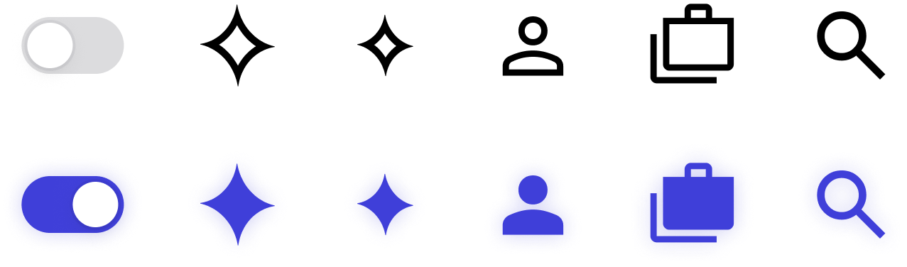
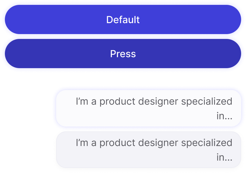
States & Feedback
A cross-platform, accessible aesthetic
We explored a “liquid glass” inspired aesthetic that felt modern and lightweight, while remaining accessible and practical.
A key challenge was cross-platform consistency. With no budget to design separate iOS and Android systems, components needed to feel native-enough on both platforms.
The solution balanced:
- iOS-inspired visual depth
- Android compatibility
- Accessibility and contrast requirements
All states and feedback patterns were designed to feel clear, responsive, and future-forward without breaking platform expectations.
Scalability & Impact
An investment that paid off
Building the design system was a deliberate upfront investment and a calculated risk.
Since implementation:
- Feature design cycles have dropped to under two weeks
- New features adapt existing components with minimal rework
- Unexpected requirements can be handled without breaking consistency
Despite changes in product strategy, PM ownership, and feature direction, the design system has remained stable and adaptable, continuing to support the product as it evolves.
Outcome
A system that grows with the product
The EZRHA Design System is now a core product asset. It enables speed without sacrificing quality, supports collaboration across experience levels, and allows the product to evolve without constant redesign.
What began as a structural necessity became a strategic foundation for long-term scalability.