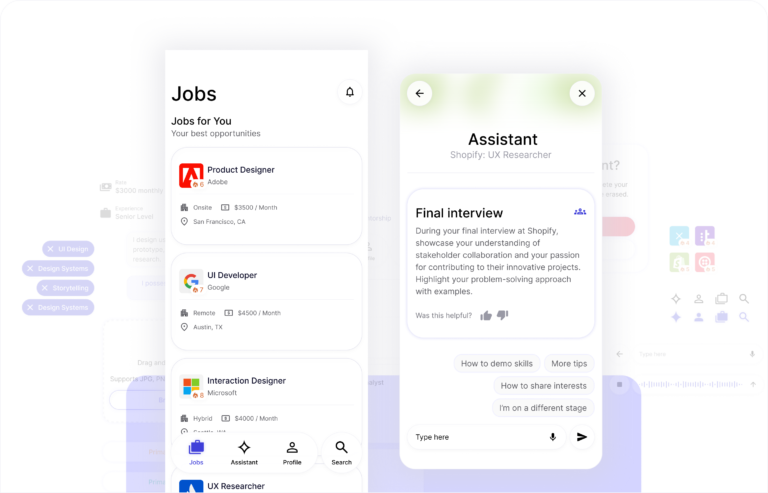
The Starting Point
Noota began as a conceptual startup idea with no existing interface, no MVP, and no visual system.
The challenge wasn’t iteration, it was creation.
In one week, I had to:
- Define the visual identity
- Create a scalable token system
- Build reusable components
- Deliver MVP-ready screens
All while maintaining readability in a high-color, music-heavy interface
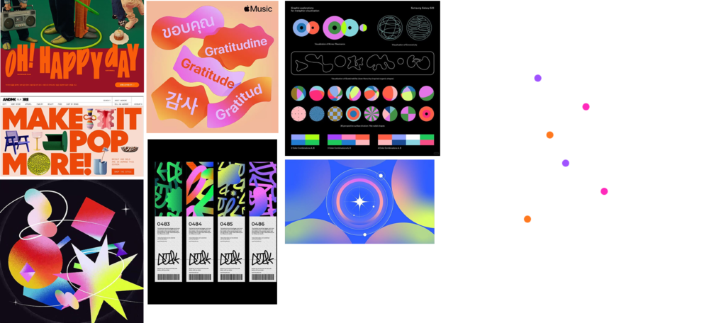
Designing an Emotional Identity
Music is expressive.
The interface needed to feel:
- Jovial
- Dynamic
- Social
- Casual
Without becoming chaotic.
The identity sliders defined balance between:
Fun ↔ Sophisticated
Dynamic ↔ Controlled
Minimal ↔ Expressive
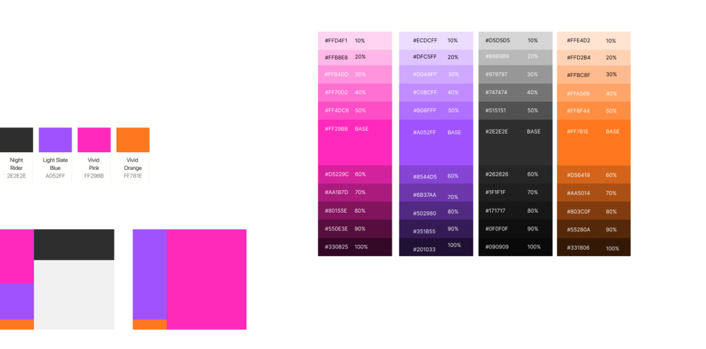
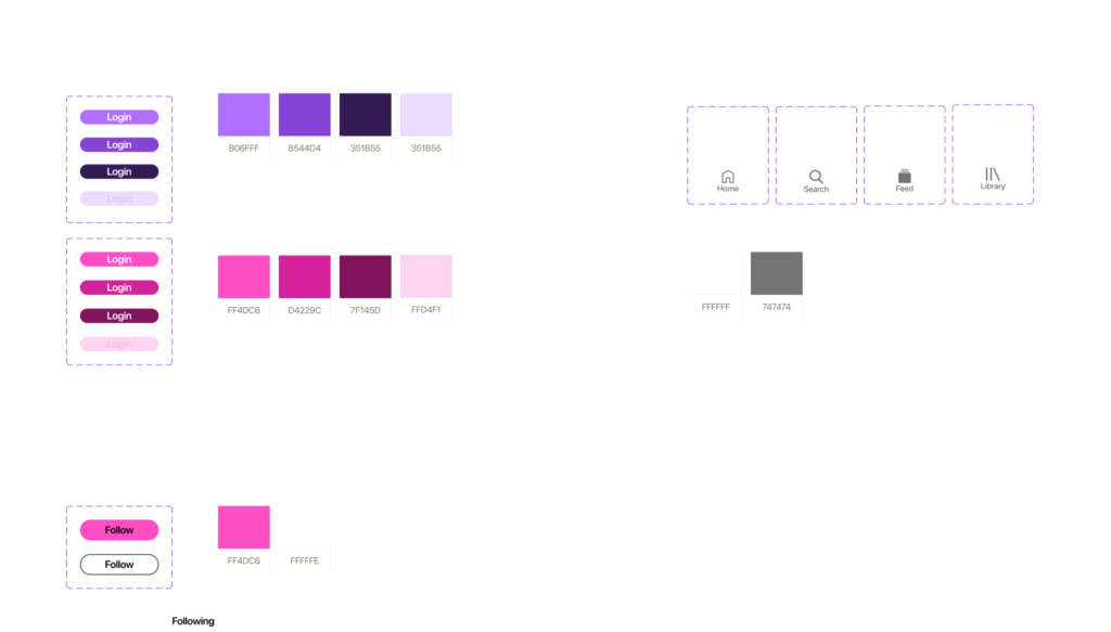
Color as Infrastructure
Instead of decorative color, we built a structured system:
- 40 color tokens
- Base + tint + shade scales
- Neutral and contrast pairs
- Defined usage proportions
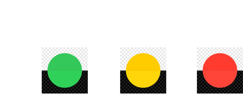
- 3 system state colors (success, warning, error)
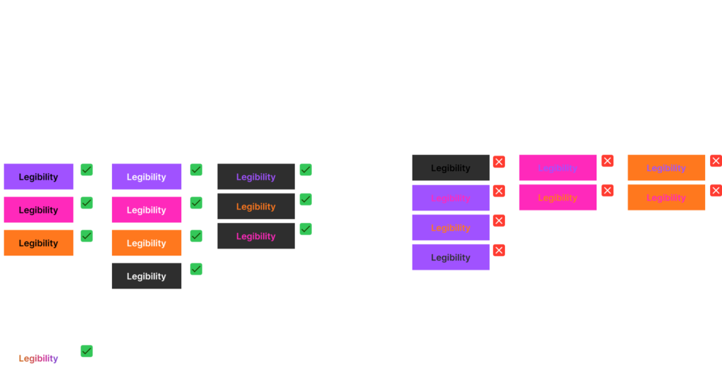
All combinations were tested for readability.
We achieved 100% readable combinations in solid backgrounds.
Transparency vs Legibility
Initial explorations used glass-like transparency layers.
This created:
- Reduced contrast over gradients
- Hierarchy competition
- White/black readability issues
The solution required:
- Restricting transparency contexts
- Limiting gradient overlap
- Formalizing permitted and prohibited usage rules
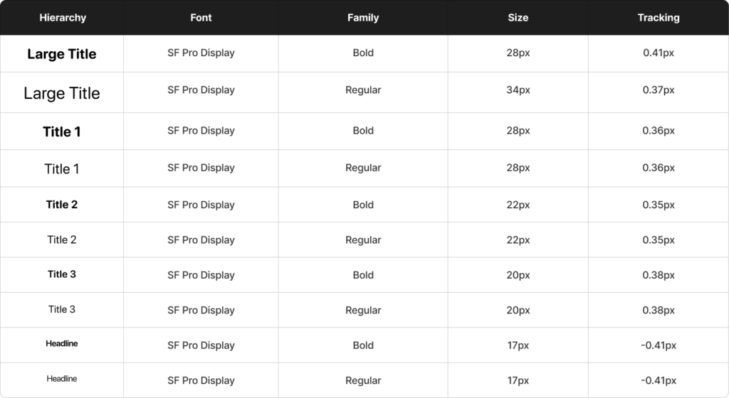
Native iOS Typography for Familiarity
We used SF Pro Display exclusively to:
- Align with iPhone-native patterns
- Reduce cognitive friction for Gen Z users
- Accelerate development
The system includes:
- 20 type tokens
- Defined hierarchy levels
- Structured scale and tracking
Trade-off:
We prioritized structure over typographic experimentation.
Designing for Density Without Saturation
Music apps are content-heavy.
To maintain breathing space, we created:
- 9 spacing tokens
- 6 layout tokens
- A vertical rhythm system
- Defined margins for feed and album lists
Spacing was intentionally generous to let vibrant colors coexist without fatigue.
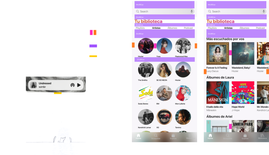
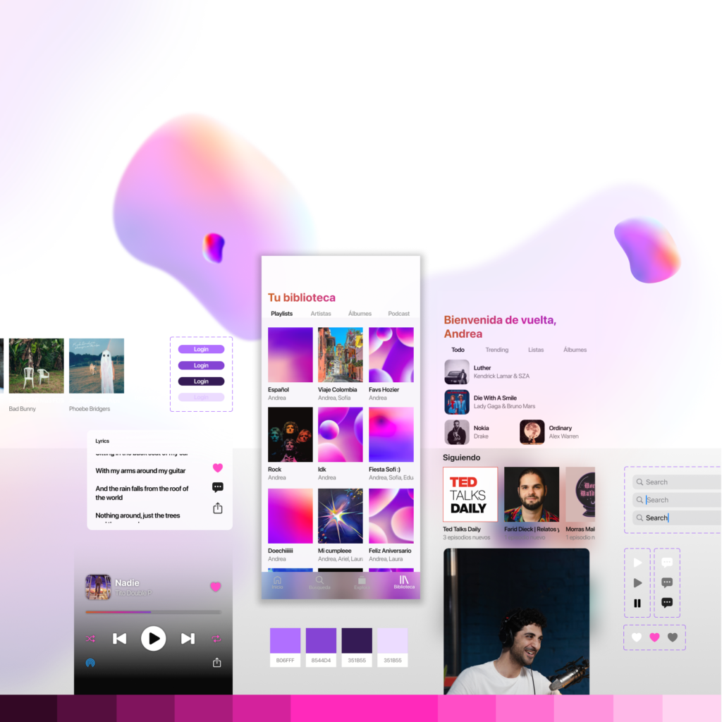
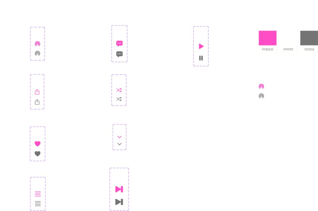
89 Reusable Components in 7 Days
The component library focused on music-specific patterns:
- Player controls
- Album modules
- Feed cards
- Artist blocks
- Playlist displays
- Navigation states
- Icon states (enabled, disabled, pressed)
Most components were content-oriented.
Trade-off:
Settings and system utility components were deprioritized.
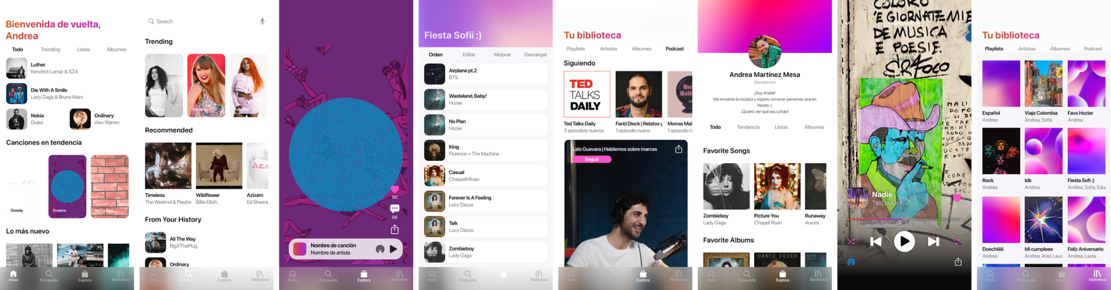
From System to Experience
The design system directly powered:
- Home feed
- Library
- Search
- Playlist views
- Artist pages
All screens were built using reusable tokens and components defined earlier.
What This Project Proves
In just one week, this project delivered a complete system foundation: 40 color tokens, 20 type tokens, 9 spacing rules, 6 layout structures, 89 reusable components, and fully functional MVP screens.
More importantly, it demonstrates:
The ability to build structure from zero, design under time pressure, balance expressiveness with usability, and iterate strategically when constraints expose weaknesses.